

As this digital age is changing, so it was needed to transform ways through which an organization’s interaction with its customers. This is where Salesforce Lightning came into play. The best way to learn is by practicing regularly, if you are thinking to learn the salesforce lightning web component, just keep the name BISP in your mind. The best institute for online training not just reading the document for the problem or the theoretical presentation of the topic, the delivery of training in a smarter way by BISP experienced faculty and they were excellent.
The Lightning data-table component displays tabular data where each column can be displayed based on the data type. The Lightning Data-table is not supported on mobile devices. Supported features include:

Tables can be populated during initialization using the data, columns, and key-field attributes. The key-field attribute is required for correct table behavior. It associates each row with a unique identifier. The data table formats the data cells of a column based on the type you specify for the column. Each data type is associated with a base Lightning web component. For example, specifying the text type renders the associated data using a lightning-formatted-text component. Some of these types allow you to pass in the attributes via the type Attributes attribute to customize your output. The data table supports dates in the format of a timestamp, a date object, or an ISO8601 formatted string. These date formats can be displayed differently in a column. The default format is September 26, 2018, which corresponds to type: "date" or type: "date-local" and an empty type attributes property.
â–º Create an apex class
Create an Apex class. Use the below SFDX Command

public with sharing class dataTableLWC {
@AuraEnabled(cacheable = true)
public static ListfetchAccounts(){
return [SELECT Id,Name,Phone,Type,Industry,Rating,Website FROM Account LIMIT 100];
}
}
â–º Create a Lightning Web Component
Create a Lightning web component using this SFDX command. this web component will display the opportunities in the table.

DataTableLWC.html:
key-field="id"
data={parameters.data}
onrowaction={handleRowAction}
row-number-offset={rowOffset}
hide-checkbox-column="true"
class="tablecls"
columns={columns}>
aria-labelledby="modal-heading-01"
aria-modal="true"
aria-describedby="modal-content-id-1"
class="slds-modal slds-fade-in-open">
Name:
{record.Name}
Phone:
{record.Phone}
Type :
{record.Type}
Industry :
{record.Industry}
Website :
{record.Website}
Rating :
{record.Rating}
label="Close"
title="Close"
onclick={closeModal}
>
DataTableLWC.js
// import module elements
import {
LightningElement,
wire,
track
} from 'lwc';
//import method from the Apex Class
import fetchAccounts from '@salesforce/apex/dataTableLWC.fetchAccounts';
// Declaring the columns in the datatable
const columns = [{
label: 'View',
type: 'button-icon',
initialWidth: 75,
typeAttributes: {
iconName: 'action:preview',
title: 'Preview',
variant: 'border-filled',
alternativeText: 'View'
}
},
{
label: 'Name',
fieldName: 'Name'
},
{
label: 'Phone',
fieldName: 'Phone'
},
{
label: 'Type',
fieldName: 'Type'
}
];
// declare class to expose the component
export default class DataTableComponent extends LightningElement {
@track columns = columns;
@track record = {};
@track rowOffset = 0;
@track data = {};
@track bShowModal = false;
@wire(fetchAccounts) parameters;
// Row Action event to show the details of the record
handleRowAction(event) {
const row = event.detail.row;
this.record = row;
this.bShowModal = true; // display modal window
}
// to close modal window set 'bShowModal' tarck value as false
closeModal() {
this.bShowModal = false;
}
}
DataTableLWC.js-meta.xml
45.0
true
lightning__AppPage
lightning__RecordPage
lightning__HomePage
DataTableLWC.css
.tablecls {
font-family: "Trebuchet MS", Arial, Helvetica, sans-serif;
border-collapse: collapse;
width: 100%;
}
.tablecls td,
.tablecls th {
border: 1px solid #ddd;
padding: 8px;
}
.tablecls tr:nth-child(even) {
background-color: #f2f2f2;
}
.tablecls tr:hover {
background-color: #ddd;
}
.tablecls th {
padding-top: 12px;
padding-bottom: 12px;
text-align: left;
background-color: #4CAF50;
color: white;
}
â–º Push Changes to scratch org
Use the below SFDX command to push the changes to scratch org

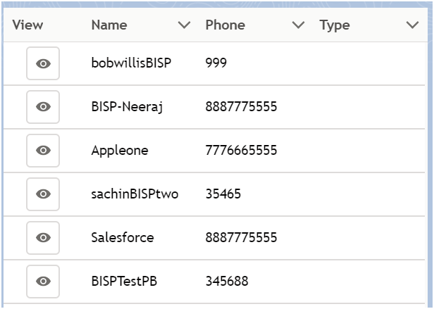
You can able to see the below data table:

Thanks for reading our blog...
Your email address will not be published. Required fields are marked *


